📖 [Rolife Journey] Update 1 Cuckoo clock

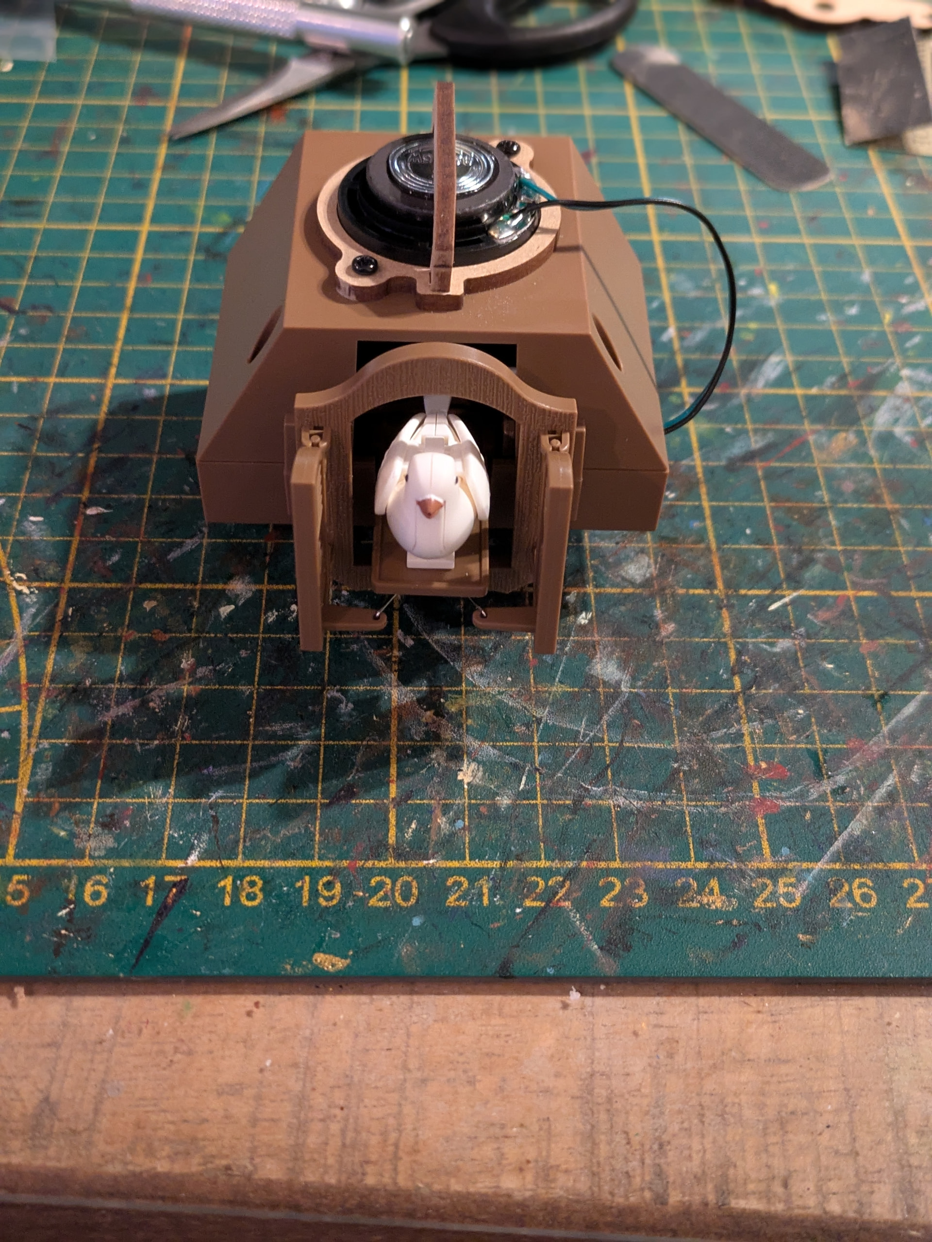
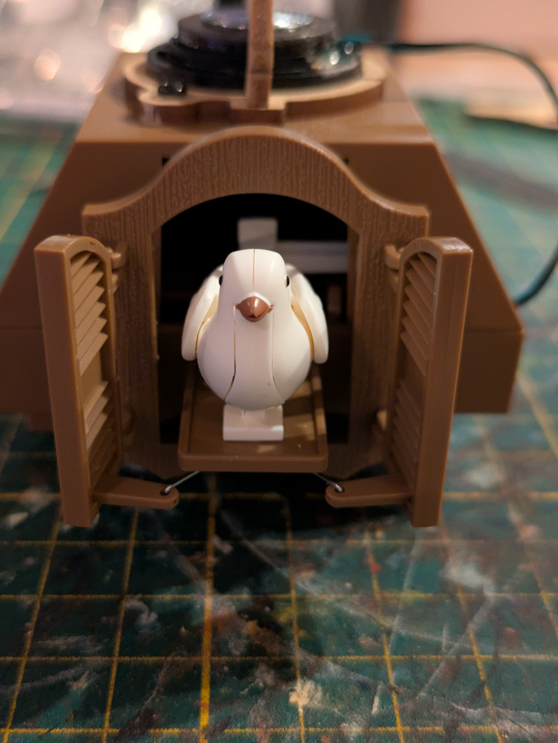
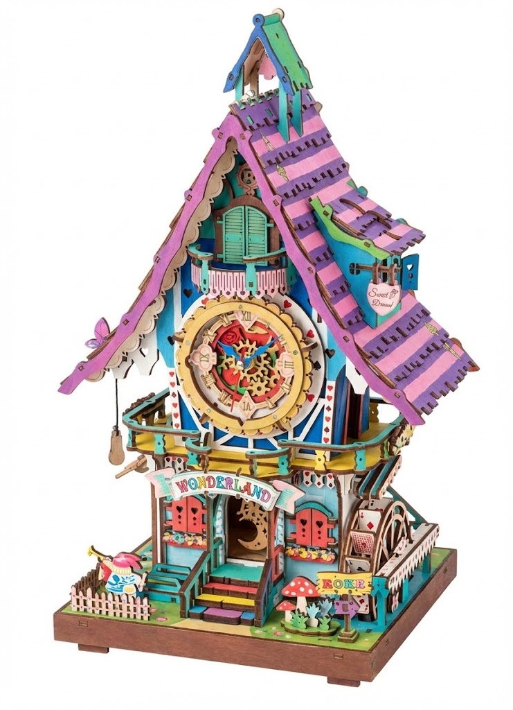
I had an hour to build it tonight. The first step has been taken. I haven’t painted it yet because I want to keep this part in its original colors. I’ll continue tomorrow and then have to decide what colors to paint the bottom section. I’m going to dream about it some more; maybe that will give me some ideas :wink:


ohh and these are the ideas ai once gave me


I found this one a bit too boring

and I think this one is a bit too intense for our living room. Maybe it should be a combination of these 2, what do you think?

5 Likes

Oh dear….I am a fan of the boring one…LOL!

1 Like

I love the green roof of the first one but like the bright colors for the clock section from the second one

Your choice…:zany_face:

1 Like

Green and pink! :smiling_face_with_three_hearts: I think the pink from the one build with that forest green from the other build would look great! Good luck sweetie! :hugs:

1 Like

I like the boring one too! It looks like an enchanted forest house or something!

2 Likes

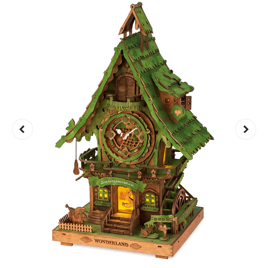
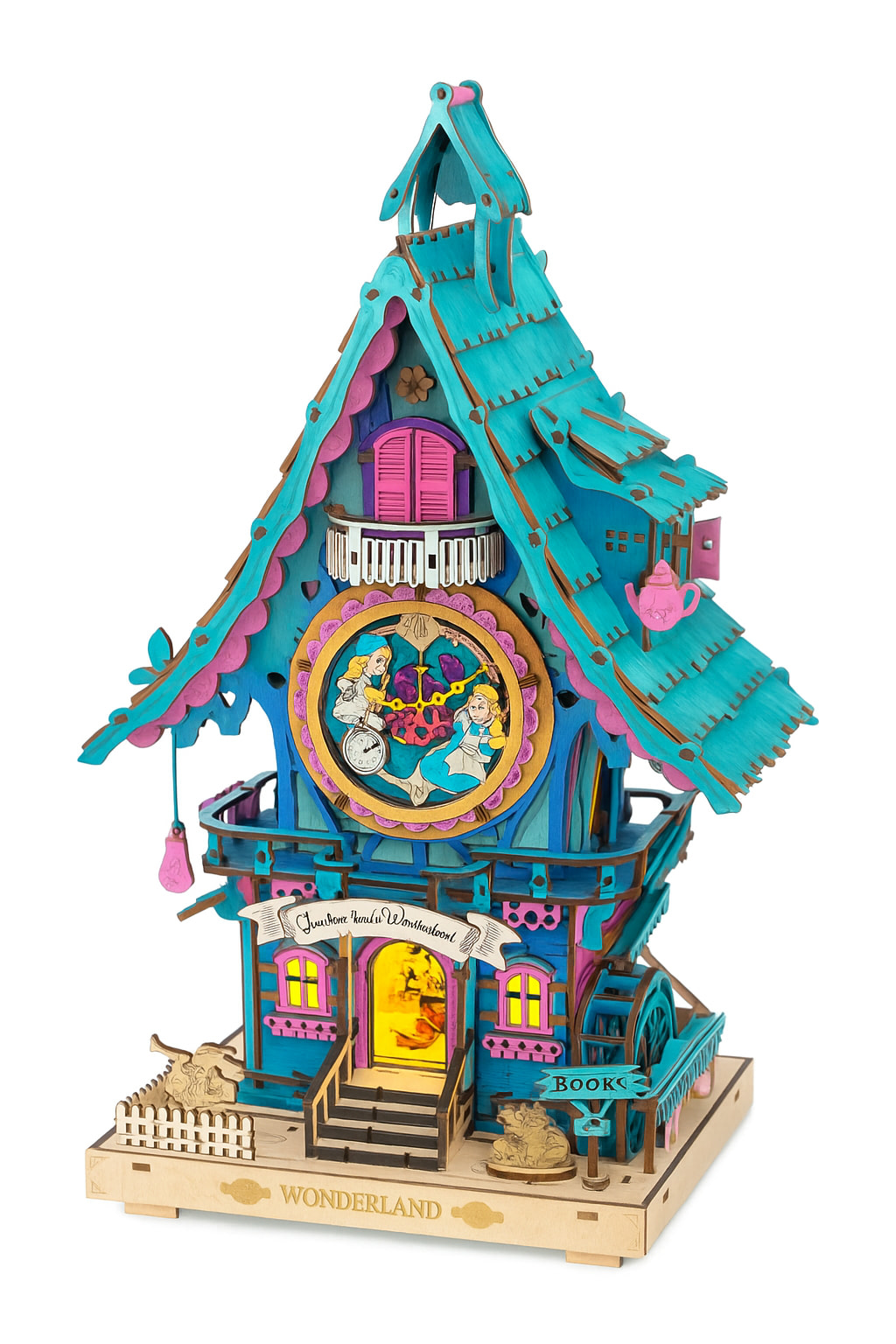
That last one is pretty vibrant. Reminds me of a Miami theme. I do like the more deep jewel tone colors in 1st. I know you will come up with something and it will look good!

1 Like

So lovely. I choice 2: green and pink

1 Like

Yes to both of them.

1 Like

Thank you @Emma_Samchek :hugs: This is the first time I really have no idea…but I’m sure it will work out with all the ideas that have already been given.

1 Like

I also think the second one is quite intense, but I find the first one very dark. I think it should be something in between :wink:

1 Like

I don’t mind both but the second one needs to tone down a little it’s burning my eyes hahahah. :laughing: I hope you’ll have an epiphany after going to bed! :smiling_face_with_three_hearts:

1 Like

It’s looking great so far! A mix of the two color ideas could be the perfect balance. The first one does feel a bit too plain, but the second one is a little too bright for me. Can’t wait to see what you decide in the end! heheh

1 Like

I think exactly the same way :wink:

1 Like

Option 2 is really horrible. I would choose option 1.

1 Like

Thanks for your opinion! I think I’ll find the right colors while building. The baseplate is just finished after I repainted it because I didn’t like the colors after all. :sweat_smile:

Yeah if you could combine them then it’s great. Otherwise the 2nd one is a little too much I think. I like the first one.

1 Like

The second one is way to much for me haha the first one is a little bit to dark i think :wink:

I played around with AI today for it to come up with this. What do you think? Another version of Alice in Wonderland

1 Like

Thank k you @Tricia12 :hugs: I still think the colours are quite intense, but I did get some inspiration for the part where the clock is located.

1 Like